All the stock market models are invested, the bond market model avoids high beta (long) bonds, the yield curve seems to steepen, and gold and silver models are not invested.
The most significant event was the decline of COMP.

Blog Archives
Update 3-1-13
Posted in uddates
Shadowing ECRI’s Weekly Leading Index (WLI)
The Shadow WLI stems from an international collaborative effort by Franz Lischka, Georg Vrba, Dwaine van Vuuren, and Doug Short. We publish the final shadow levels one day ahead of the official ECRI WLI for underlying component data to Friday of the prior week.
Read more >
Posted in develop
Improving on Buy and Hold: Updated Model Description
The IBH stock market model was updated several times since its original publication in August 2010. Some of the updates were published in Advisor Perspective, and others were published in the weekly newsletter. The IBH model incorporating the latest updates produced a compound average annual return of over 13% from 1966 to 2013 (excluding dividends).
Posted in develop
Favorite Websites
Advisor Perspectives/Doug Short
A Dash of Insight
Franz Lischka’s Blog
No Spin Forecast
Portfolio123
Quantocracy
Read more >
Posted in links
Update 2-22-13
The BVR-model avoids high beta bonds and the yield curve model expects the yield curve to steepen.
Posted in samplerUpd, uddates
Recession Indicators: A Stock Market Exit Strategy.
Investors with long-time horizons can also do well by only exiting the stock market at beginnings of recessions and returning to the market when the market is recovering. Recession indicators such as COMP are useful in identifying recession starts.
Silver outshines gold
The long-time average annual return from silver based on the signals from a modified Coppock indicator exceeded those from gold by a considerable margin, 19.7% for silver versus 14.9% for gold.
iMarketSignals – improve investment performance
We provide unbiased guidance to market direction. Our models can be classed into following groups:
Read more >
Posted in homepage
Update 2-15-13
The models remain invested in the stock market and avoid high beta bonds.
Posted in uddates
Update 2-8-13
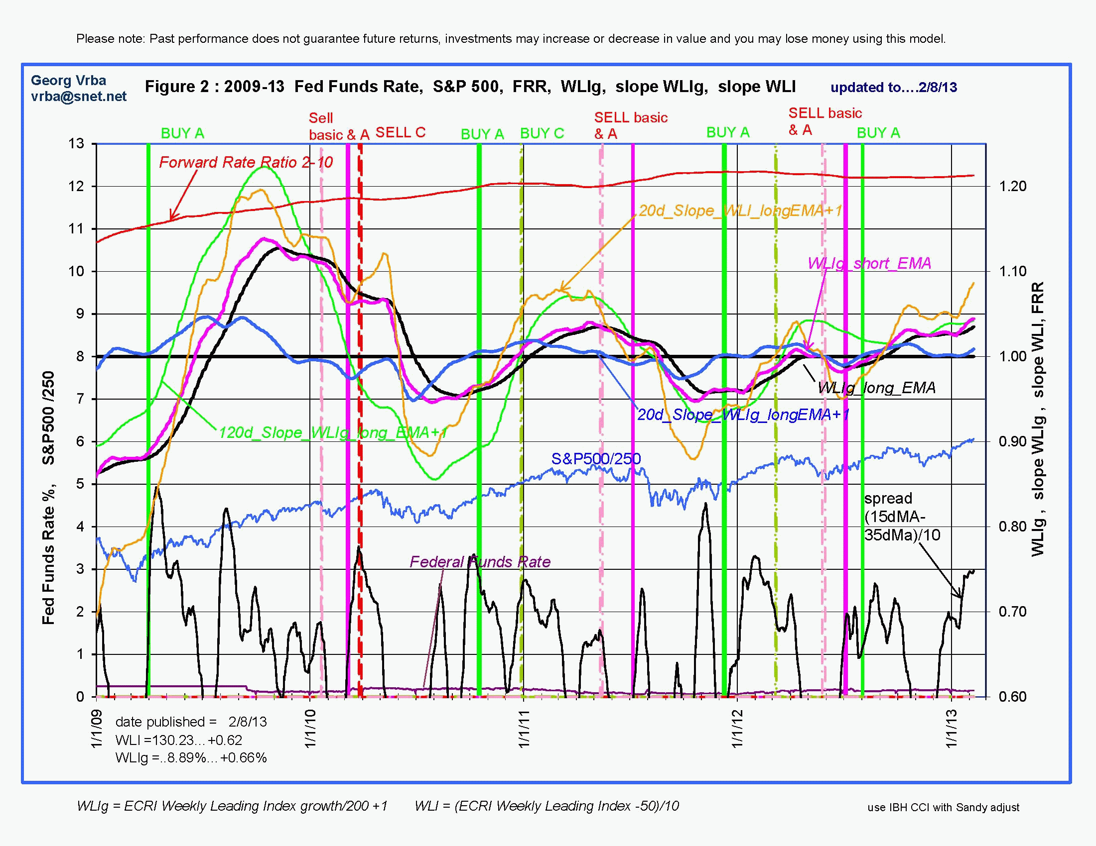 ECRI reported the WLI at a level of 130.2 and the six months smoothed annualized growth WLIg at +8.9%, both numbers are higher from last week, as shown in Fig 2. One can see that the indicator graphs have a generally upward direction now which is usually the pattern for an upward bound market. The model is invested in the S&P500.
Read more >
Posted in uddates
With reference to Section 202(a)(11)(D) of the Investment Advisers Act:
We are Engineers and not Investment Advisers,
read more ...
By the mere act of reading this page and navigating this site you acknowledge, agree to, and abide by the
Terms of Use / Disclaimer