
A major bull market may have commenced in 2009 for which evidence was presented in various 2012 commentaries (Appendix A), and also in this article which included a statistical analysis of the historic data of the S&P Composite, updated here. Since August 2012 the S&P500 has gained a real 30% to the end of 2013. So what further gains can we expect?
Will the bull market continue?
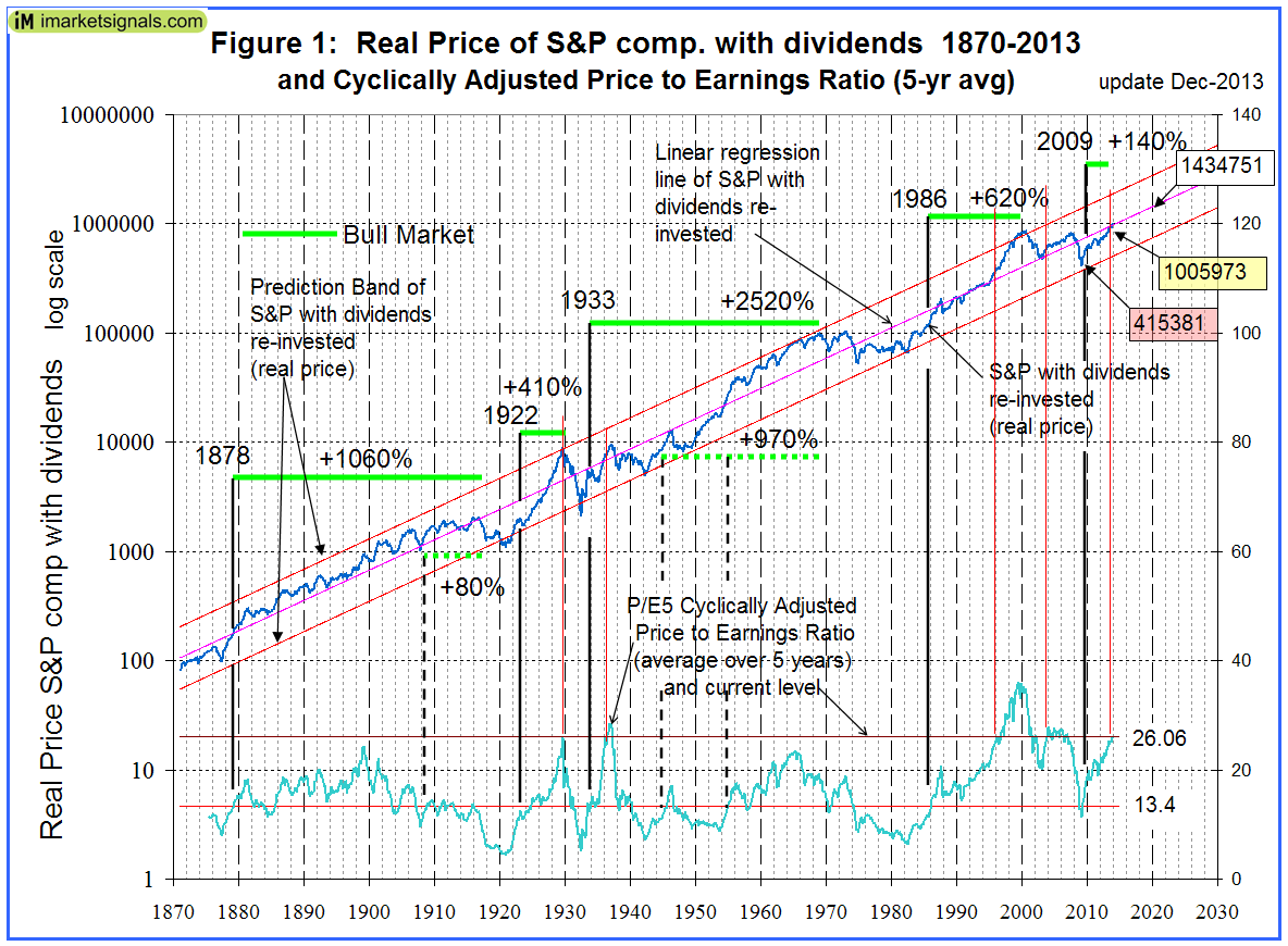
Nobody knows, and the best we can do is to use the historic data (which is from Shiller’s S&P series) to guide us to make estimates for the future. From the real price of the S&P-Composite with dividends re-invested (S&P-real) one finds that the best fit line from January 1871 onward is a straight line when plotted to a semi-log scale. There is no reason to believe that this long-term trend of S&P-real will be interrupted. S&P-real and the best fit line together with its prediction band are shown in Figure 1, updated to Dec-2013. (See appendix B for the equations.)
Also shown is the Cyclically Adjusted Price to Earnings Ratio P/E5 (which is the real price of the S&P divided by the average of the real earnings over the preceding 5 years), currently at a level of 26.1.
One observes that whenever S&P-real “bounced-off” the lower extreme of the prediction band and P/E5 moved from below to above 13.4 a bull market always followed. The last time this occurred was in March 2009. Since then S&P-real has “only” gained about 140%. Comparing this to previous post-bounce-off-gains (which ranged from 300% to 1720%) then one could conclude that there is some steam left in this bull market with further gains to come.
What gains (if any) can we expect?
Extending the best fit line and the prediction band to 2020 provides a glimpse into the future which enables us to estimate the change of S&P-real from the current level of about 1,006,000. In 2020, the value of S&P-real as indicated by the best fit line is about 1,430,000, while the lowest and highest values shown by the prediction band are 740,000 and 2,770,000, respectively.
Thus the historic trend forecasts a probable gain of about 40% for S&P-real over the next six years. The worst scenario would be a possible loss of about 25%, and the best outcome would be an approximately three-fold increase of the current price.
What other analysts expect
Commentators, such as Butler|Philbrick and Hussman warned us in December 2011 that the markets then were expensive and overbought, and that one could only expect very low returns going forward over periods as long as 20 years. Figure 2 shows the current situation in more detail and also includes the levels of S&P-real as per Butler|Philbrick (B|P) forecast, indicated by the red markers connected by the dashed red line.
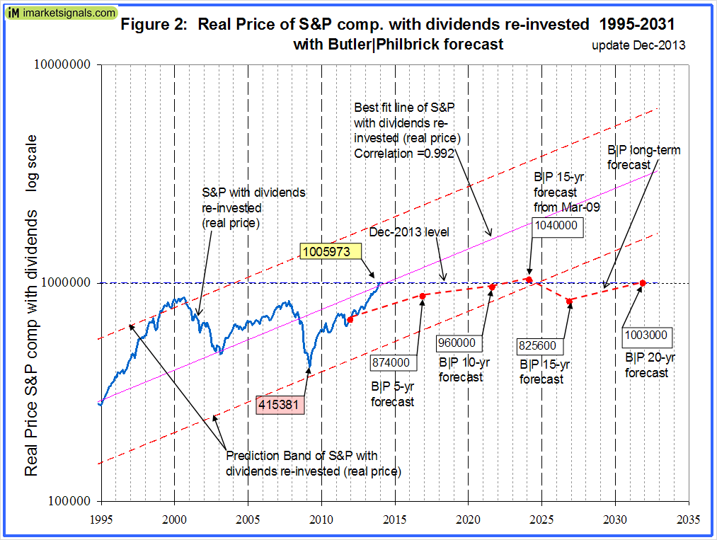
From December 2011 onward B|P predicted a real annual return for the stock market of only 1.46% for 15 years, and 2.08% for 20 years (Table 1 in their article and Appendix C below). Also they forecasted a 6.48% annual return from March 2009 to March 2024 (Table 2 in their article). One can see that the March 2024 level is quite possible as it is just above the lower extreme of the prediction band, but it would appear that the December 2026 and 2031 forecasts are overly pessimistic.
If one applied B|P’s anticipated 1.46% growth rate for 15 years then S&P-real would only be 24% higher by the December 2026 from where it was in December 2011. So far, to the end of December 2013, the S&P with dividends has gained 57.7% from the time when their article was published on December 14, 2011. This equates to a gain of 56% in real terms for the first 2 years of the 15 year forecast period. If one believed B|P’s forecast, then one can logically only expect a loss for S&P-real for many years ahead. It also means, that if one takes such forecasts seriously, it would be complete folly to invest in the stock market for the next two decades, because the current level of S&P-real is already above B|P’s 5-yr, 10-yr, 15-yr, and 20-yr forecast levels.
Is the market overvalued?
One observes from Figure 1 that presently S&P-real is where it should be; its level borders on its long-time historic trend line.
The P/E5 is at a high level of 26.1, which may indicate an overvalued market, but its graph has an upward slope. Similar conditions prevailed only 4-times in the past: in 1929, 1936, 1995 and 2003. Only after one occasion, in 1929, was it followed by a significant market decline; however, at that time the S&P-real was located at the upper extreme of its prediction band. At the three other occasions the S&P-real was near its long-term trendline, as it is now, and the market continued to advance for several years thereafter.
Long-term investors should also heed Shiller’s recent warning, and consider the level of the Shiller P/E10 ratio, currently at 25.4. He states that the plot of P/E10 “confirms that ……Long-term investors would be well advised, individually, to lower their exposure to the stock market when it is high, ….., and get into the market when it is low.” The plot shows that for a P/E10 of 25 one can expect a 10-year annualized return of between -5% and +5%. So caution is certainly indicated and one should consider market-timing models, such as the ones listed in Appendix D, to time one’s exposure to the stock market.
Appendix A
Previous articles in support of a bull market:
- Estimating Stock Market Returns to 2020 and Beyond>
- Is the Next Great Bull Market Already Here?
- Get Ready for the Next Great Bull Market
- Anticipating the Ultimate Death Cross
- The Ultimate Death Cross – False Harbinger of Doom
Appendix B
The best fit line and prediction band were calculated using statistical software from PSI-Plot. There were 1699 data points from Jan-1871 to July-2012. The SP-real values for the period after July-2012 are “out of sample” and were not included in the regression analysis.
The equation of the best fit line is y = 10(ax+b) .
y = is the dependent variable of the best fit line.
x = are the number of months from January 1871 onwards.
a = 0.0023112648
b = 2.02423522
The Pearson correlation coefficient is 0.992. This number is most appropriately applied to linear regression as an indication of how closely the two variables approximate a linear relationship to each other. A perfect fit would have a correlation coefficient of 1.000.
The equation of the upper and lower extremes of the prediction band is y = 10(ax+b)
with parameters ‘y’, ‘x’, and ‘a’ as before, but with
b = 2.31005634 for the upper extreme line, and
b = 1.73841411 for the lower extreme line of the prediction band.
Appendix C
Butler|Philbrick real returns forecast for the stock market from December 2011.

Appendix D
Market-timing models periodically updated at imarketsignals.com:
- IBH – Improving on Buy and Hold: Asset Allocation using Economic Indicators
- The Improved MAC-System
- iM-Best(SPY-SH) Market Timing System: Gains for Up and Down Markets
- A Modified Coppock Indicator for the S&P500
- COMP-IBH – The Use of Recession Indicators in Stock Market Timing
- Exit Signals for the Stock Market from iM’s Business Cycle Index
I see more reference in other articles and sites to PE 10, not PE 5. Why do you you PE 5? How does this analysis change using PE10?
Thanks.
Most of us are familiar with the Shiller cyclically adjusted price to earnings ratio of the S&P. It is the real price of the S&P divided by the average of the real earnings over the preceding 10 years and is identified as P/E10 in Shiller’s S&P data series. The 10 year period seems to have been arbitrarily chosen so as to minimize the effects of business cycles.
I am using P/E5 for my analysis, which is the real price of the S&P divided by the average of the real earnings over the preceding 5 years. The reason being that it is more sensitive than P/E10 for the analysis I wanted do.
Doug Short made a post at Financialsense.com in which he showed that the S&P 500 is 80% above its long-term trend based on his regression analysis. He also goes back to 1871 with inflation-adjusted prices on a semi-log scale. His finding seems to be the opposite of yours in this post here in which you present the argument that the S&P composite is just about at its long-term trend line.
I would appreciate your thoughts on how your regression analysis compares to Doug’s.
Thank you very much for your continued sharing of your analysis.
http://www.financialsense.com/contributors/doug-short/long-term-market-performance
I have contacted Doug so that we can compare our analysis. My analysis is the same I used in August 2012 to predict further gains for the S&P500 then. I will follow this up once Doug sends me his spreadsheet to see why we differ.
Doug has informed me that the difference in the analysis which caused the confusion is that his calculation is based on the index price(without dividends), not the total return:
http://advisorperspectives.com/dshort/updates/Regression-to-Trend.php
When he focuses on total returns (which he updates every few months), he prefers to look at rolling returns:
http://advisorperspectives.com/dshort/updates/Total-Return-Roller-Coaster.php
I appreciate the clarification.
That clarification is hugely important. Who would have thought that the inclusion of dividends would have been so important to the calculus?
Including dividends distorts the analysis. Doug Short is doing it correctly. Since dividend yields move inversely to price, and the benefit of reinvesting them is depressed as well when dividend yields are low since you can buy fewer shares, the high dividend yields during the decades previous to the 1990’s(and the corresponding acceleration of returns from reinvested dividends when markets recovered from declines) distorts the trend line upward substantially.
The price of the index is what should be used in determining a best fit of where the future price of the index should be. That should be self evident. To then estimate total returns one should add in what the expected yield should be over that time frame, which is not that hard to do. Basic algebra. But basically higher trending index prices would yield lower assumed dividend additions, and lower prices would add. This moderates the impact of the price movement upon returns somewhat.
This has been done by many in various ways (See Arnott, Asness, Shiller and others) and is implicit in Butler/Philbrick.
Whatever the case, a trend line of returns which includes dividends is not a valid approach to giving an idea of future market prices, and since price and the yield move inversely it is a truly unreliable guide to future returns as well. There is a reason Doug and every researcher of note does not do it this way.
Lance, in my article I do not make a projection of the index. I do include dividends and provide for inflaton to calculate the historic real return from the S&P. Butler/Philbrick said they estimated real returns up to 20 years ahead. If they did not include dividends in the estimate then what sort of a return would they have forecasted? In any event we will have to wait to 2032 to see if their forcast was wrong.
My analysis shows over a 140+ year period a straight upward sloping trend-line for the log10 of the real price of the S&P with dividends reinvested.
Nowhere do I state that I am making an estimate of future S&P market price, although one could calculate it from my projections.
To me it makes no sense to calculate a trend-line for the S&P without dividends. It tells you nothing, except that in the old days the S&P gained less over time (companies payed out higher dividends then), whereas more rently the S&P gained more over time because the dividend pay-out became less, so companies could grow faster than in the past and therefore their stock prices increased more over time than in the past.